
Company:
Red Hat (Customer portal team)
Category:
UI, UX & Web Design, Research
My Role:
Researcher, UI & UX Designer
At Red Hat I designed across AI products, internal tooling and customer-facing portal features - complex enterprise workflows, at scale.
Objective
Redesign Red Hat's 'Contact Us' pages so customers reach the right team the first time - with clear team scope, support hours, and an intuitive menu structure.
Problems to Solve
• Customer-facing team information was hard to find
• Misrouted inquiries caused delays and poor customer experience
• Queries landed with the wrong team, wrong region, or outside support hours - email was the only fallback

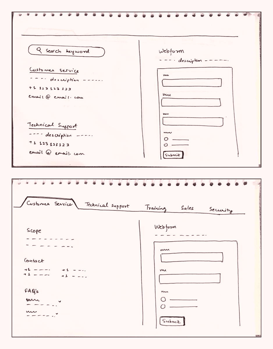
Early explorations:
🟢 Early explorations focused on a webform-based design, inspired by research and team discussions suggesting it as an effective solution.
🟢 In one concept, team names were organised as tabs at the top, allowing users to click and view detailed information alongside a webform.
🔴 Due to time constraints, the engineering team decided to prioritise a simpler version for immediate release, postponing the webform implementation for a later phase.

Later iteration sketches:
🟢 We later opted to organise information by region, creating collapsible cards containing all team contact details for a specific region.
🔴 While functional, this design required multiple clicks for users to reach a team, prompting us to explore ways to streamline the process and enhance the user experience.

Final Designs
🟢 To address the issue of excessive clicks, we moved away from collapsible cards and adopted a side scrollbar design.
🟢 In this layout, all cards are fully expanded, enabling users to scroll or use the "Jump to Section" links on the left for quick navigation.
🟢 Each card is region-specific and caters to different languages, with contact details tailored accordingly.
🟢 Language tags are included for clarity and can be hovered over for additional information.
🟢 Based on research insights and stakeholder feedback, we emphasised two major teams by giving them prominent visibility.
🟢 Other teams are displayed with smaller visibility on the right side, ensuring a balanced hierarchy.